

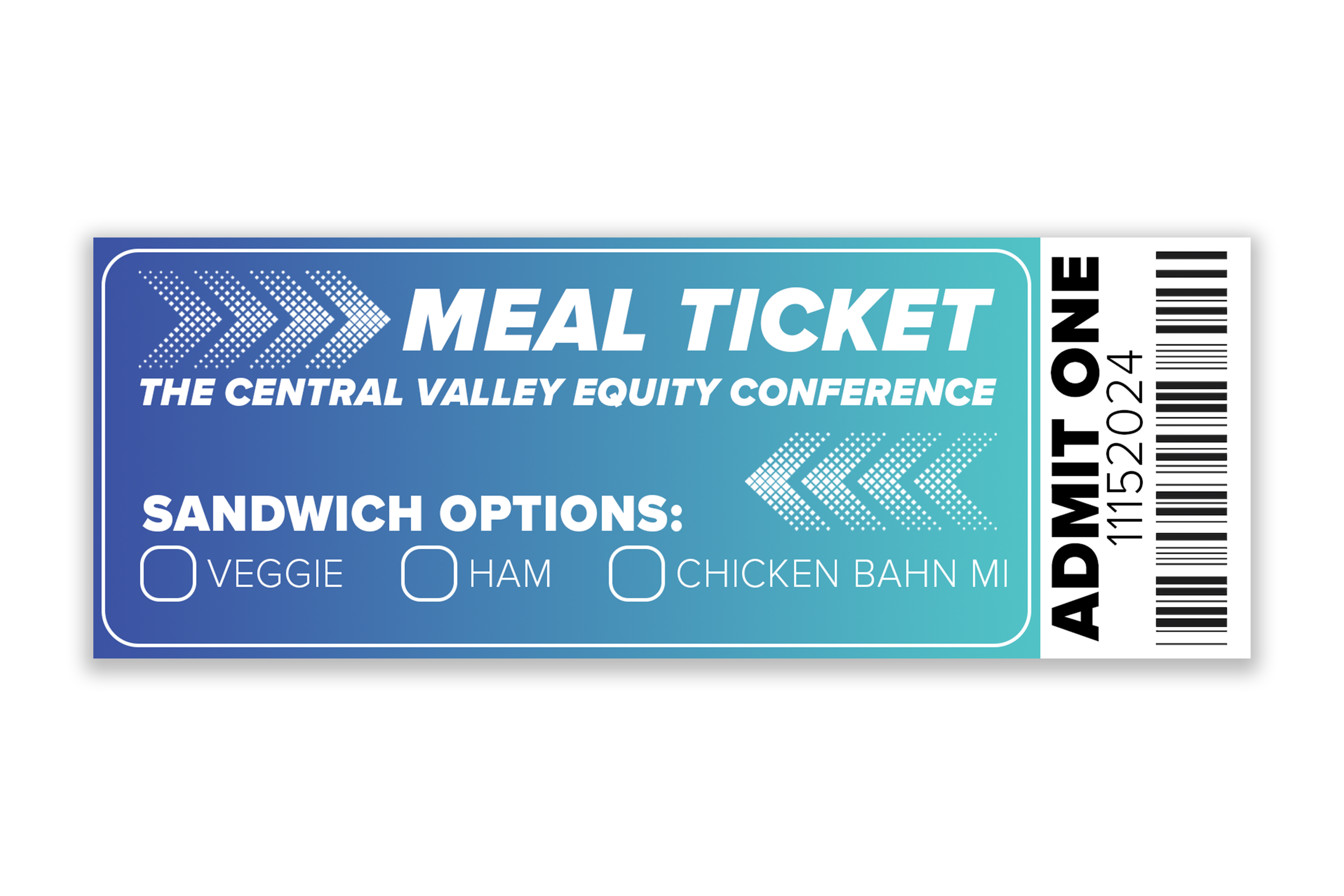
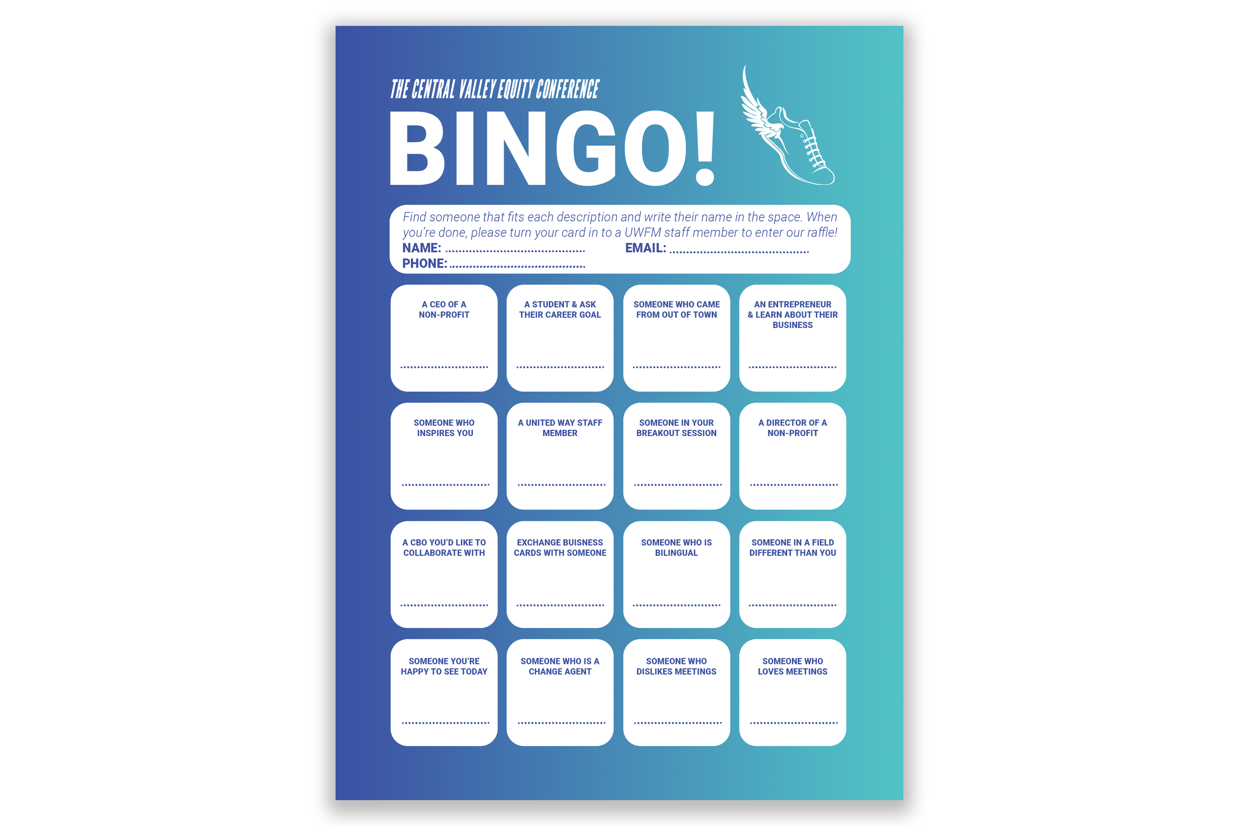
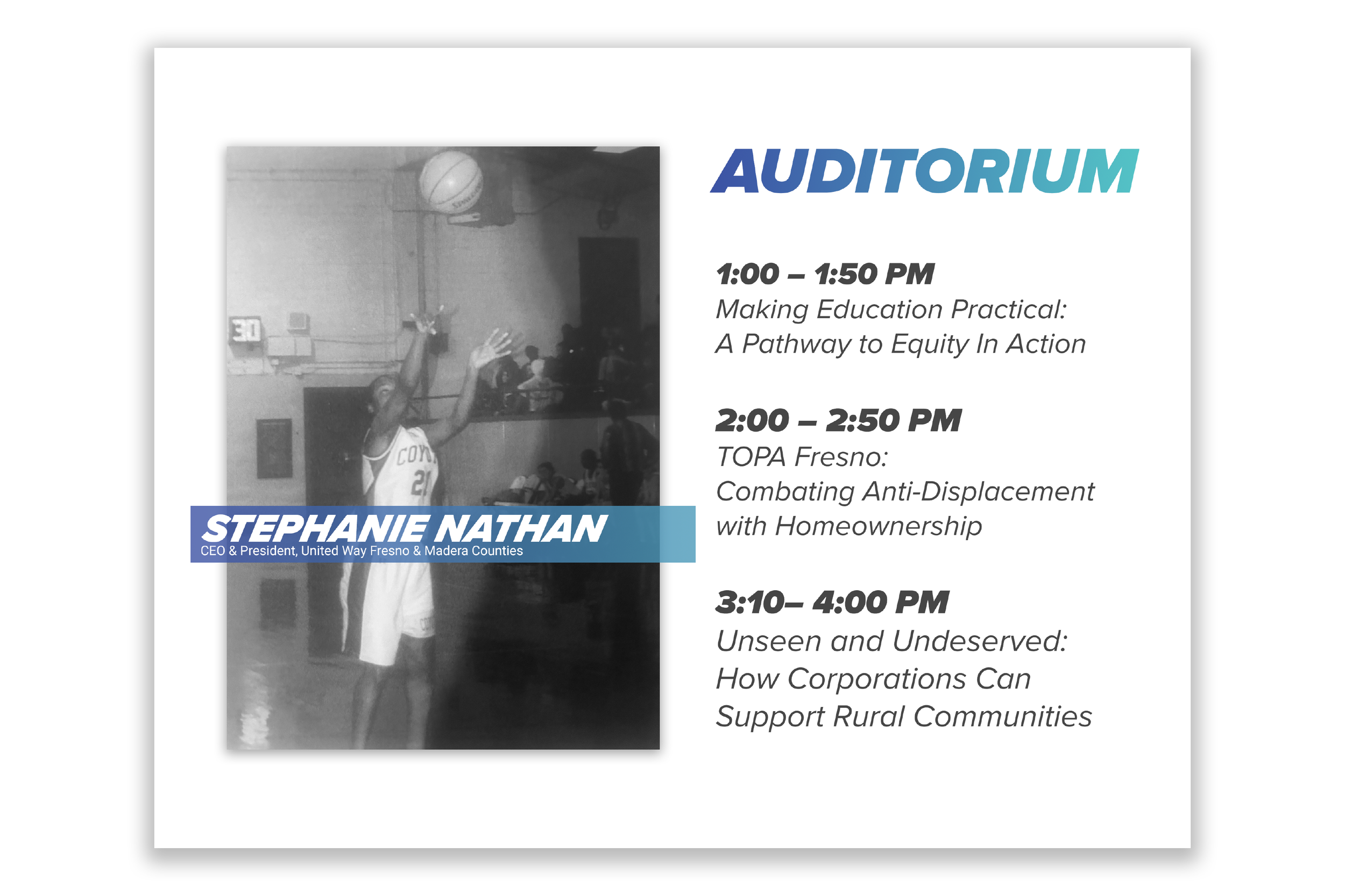
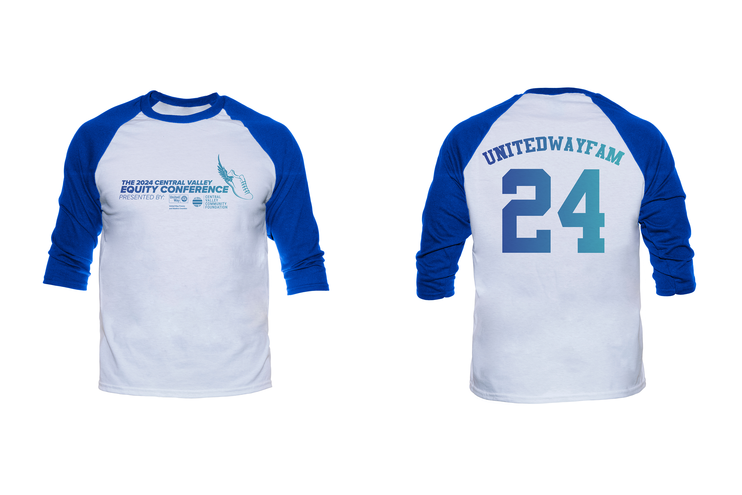
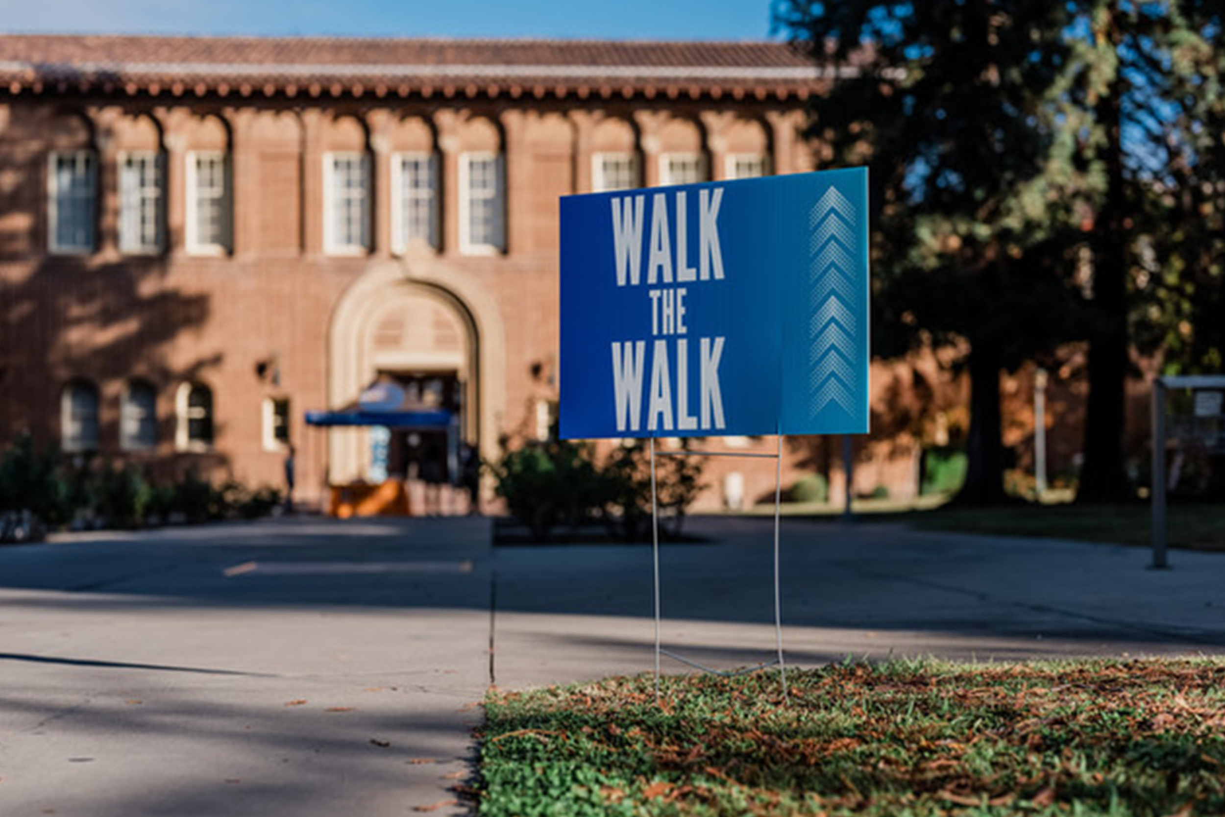
When United Way Fresno and Madera Counties partnered with the Central Valley Community Foundation to launch the Central Valley Equity Conference, we were asked to develop the event theme and branding. The Vice President of Impact at UWFM expressed a desire for the conference to showcase “equity in action.” Building on that key phrase, we proposed taking “action” literally—leading to a dynamic, sports-inspired theme. We designed an event logo featuring an athletic shoe and introduced the tagline “Walk the Walk.” Each attendee received a branded gym bag filled with conference materials, including sports-themed stress balls and “Equity in Action” lanyards. Table centerpieces were creatively built from upcycled trophies, pom-poms, astroturf, and custom pennants. We curated pre-game style music playlists and designed all event materials—including programs, signage, and slide decks—with visual cues inspired by sports broadcasting. The theme was cohesive, fun, and a way for participants to remember to turn ideas into movement.


Los Banos Community Schools asked us to help develop a brand identity that:
• Honors their unique model of one central hub and 15 autonomous schools
• Visually represents each of the individual schools
• Incorporates elements of nature to express their collective identity
• Feels appropriate for a wide age range, serving students ages 5 to 18
• Evokes a sense of collective care and community
To meet this vision, we created logo concepts that pulled a representative color from each school, then condensed similar hues into a unified color palette (e.g., crimson, cherry red, and scarlet were merged into a single red). In the tree and sunshine logo variations, each leaf or ray represents one school, with the size of the element reflecting whether it serves younger children, pre-teens, or teenagers. We used fonts that are youthful yet professional, and included optional design elements that reflect the personality of Los Banos itself, such as the Central Valley sun and the great blue heron that populates their marshland.


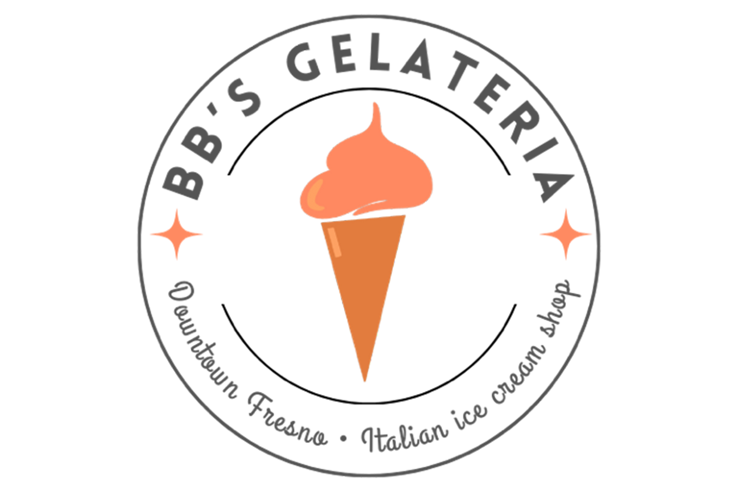
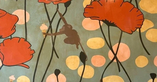
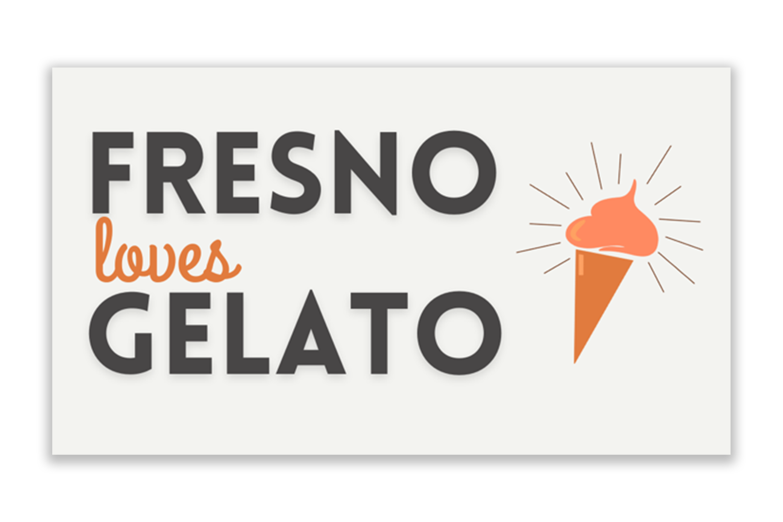
When Stacy Williams purchased the existing Gelateria Del Centro in December 2024, she renamed it BB’s Gelateria and needed a fresh brand identity to match the new chapter. We drew inspiration from the shop’s existing murals and wallpaper, pulling a cohesive color palette and incorporating core gelato iconography to maintain visual continuity. Given the shop’s connection to Warnors Theatre—a landmark known for its distinctive Art Nouveau architecture—we curated a selection of fonts in that style. Stacy selected her favorites, helping shape a brand that feels both rooted in downtown’s history and the shop’s beginnings, yet still uniquely her own.